When the Architecture Enters a Contest With the Art
Have you noticed that there is a tendency to create buildings with as much experience as the art they contain? In recent years the topic of Art and Architecture, or the Architecture of the Art museums, has used its fair share of ink (or keyboard stroke!). Let's dive into some of the most spectacular buildings and wonder - does it work or not to the service of art?


Museums and their architecture have become a battleground rich in controversy. When art, architecture, millions of dollar, ”starchitect”, statement and political power are intertwined, what does it results in? Success or failure? Here are some of the most intriguing designs in the past two decades, but they aren’t always staying away from criticism.

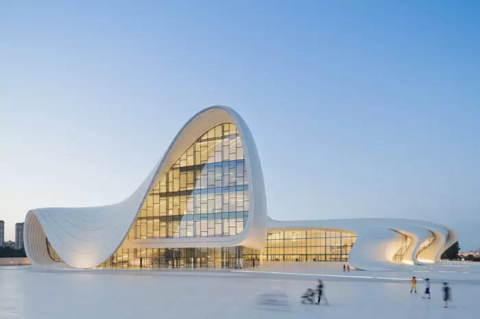
Heydar Aliyev Center, Azerbaijan
Architect: Zaha Hadid (Irak | UK)
Ok – we may have cheated from the start as this one isn’t simply a museum, it is an art gallery, museum, and conference hall, and one of the best work by architect Zaha Hadid. The fluidity of the design is meant to be the architects’ interpretation of traditional Azeri calligraphy and other historical references.

Niterói Contemporary Art Museum, Brazil
Architect: Oscar Niemeyer (Brazil)
This building was completed in 1996 – it looks like a flying saucer but also offer amazing panoramic views of Rio de Janeiro. While it is spectacular, it looks, at least from the outside, a little hard to showcase art on a curved wall. This conundrum, known now as the ‘Guggenheim dilemma’ has been solved by the architect when he designed an inner hexagonal-shaped core of space enclosed by flat screen walls.

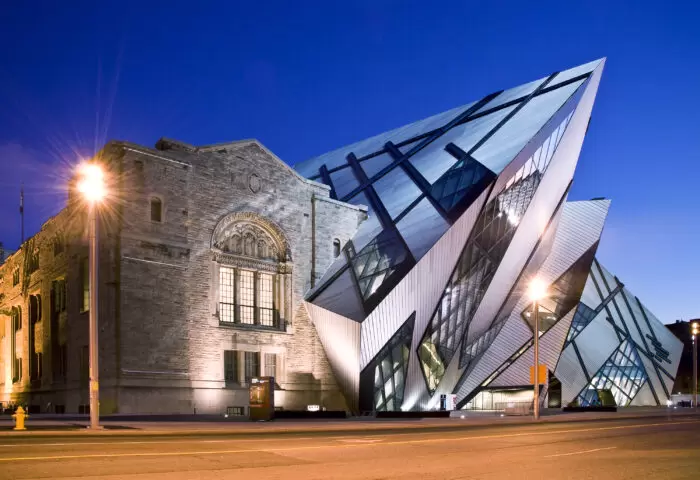
Royal Ontario Museum, Canada
Architect: Daniel Libeskind (Poland | USA)
This wasn’t one that won the affection of the Canadians ( and other museums and art lovers) overnight. Known as ”the crystal” it was highly controversial when it was completed. The controversy was mainly over it’s aggressive and angular shape, which many feel clashed with its heritage counterpart. Furthermore, it fuelled the debate about ”starchitecture” just like another museum in this list – the Guggenheim Bilbao. It was designed by Daniel Libeskind, who, just like Gehry, could have made the list more than once. While displaying art in those angular rooms have been challenging, but it also provided an interesting setting to display it, it is the lack of ”weather” proofing that has made the news more often in recent year. Apparently, the ROM isn’t the only Libeskind architectural creation of Daniel Libeskind that has also suffered from weather-related complications…
Fun fact – Some critics have gone as far as to rank it as one of the ten ugliest buildings in the world

Louis Vuitton Foundation, France
Architect: Frank Gehry (USA)
Opened in 2014, and with a price tag of little over $140 million, this building seems to defy gravity. Gehry is said to have looked at cloud form to find his inspiration and wanted to “provoke visual ruptures that reinterpret perspectives.” With its huge glass structure, the museum seems to also pay homage to another architectural monument of Paris, Le Grand Palais. No dilemma or conundrum here in its 11 exhibitions space. The strange shape, neither geometric nor organic, vanishes from the inside.

Tel Aviv Museum of Art, Israel
Architect: Preston Scott Cohen (USA)
Opening by the end of 2011, the Herta and Paul Amir Building is taking its place on the western side of the museum. It housed an Israeli Architecture Archive and a new section of Photography and Visual arts and added to the museum more than T 18,500 square feet of gallery space over five floors. Bringing the museum into modernity, one can’t feel the difference between the older building and the new; while the angle could have provoked awkward space to display art, its monumentality and spaciousness actually make it shine!

The Soumaya Museum, Mexico
Architect: Fernando Romero (Mexico)
Added to the Soumaya complex in 2011, this building is something else – the 6-story building’s exterior is made of 16,000 hexagonal aluminum plates, often giving observers the impression that it is sparkling. The upper floor is also graced with direct sunlight due to its semitransparent roof. It is avant-grade for sure, and many say that it recalls Rodin’s sculptural work, one of the museum’s favourite artist, as this museum is known for having the largest casts of sculptures by Rodin outside of France.

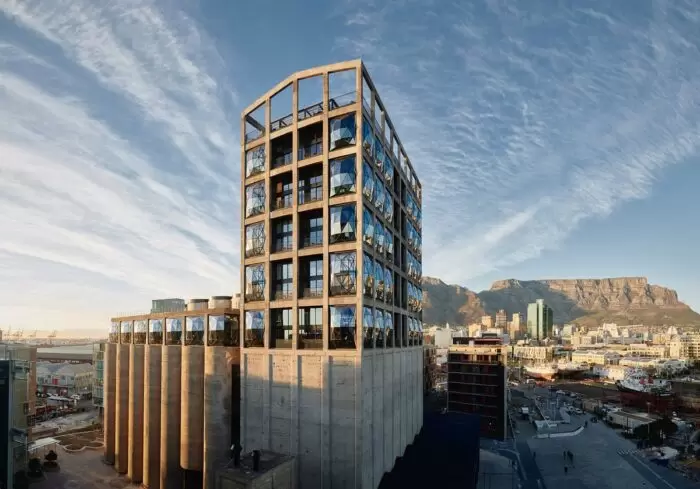
Zeitz MOCAA, Cape Town, South Africa
Architect: Heatherwick Studio (UK)
This building is the creation of Thomas Heatherwick, who also gave us New York’s Vessel (do we need to go there? let’s just say that between eye sore and danger to public health and the fact that… it is closed to the public… you get the point) But here, he did right, paying homage to the building history and the silos it has been built from. It is said that: ”Heatherwick even digitally analyzed a piece of corn once held there and based the resulting building on its form. “My one regret is that we couldn’t have cut out that grain of corn and put it next to the museum on the square.” Its cathedral-like space, infused with natural light, has created something out of this world to experience art!

Guggenheim Bilbao Museum, Spain
Architect: Frank Gehry (USA)
Ahhh, the museum after which the curve wall dilemma has been named. But let’s be honest, by now, Gehry should be a master at complex and convoluted forms. People have talked for a long time about the potential success of this building, as the approach was unusual at the time. In the end, this building caught everybody by surprise by offering a pleasing and elegant place to see art. Still people as well as the art and architecture world still have polarised view on it – and what to say about the locals… Still, the Guggenheim has been quick to note that the institution succeeded in drawing millions of visitors and boosting the local economy, and a “museum boom” fueled by a desire to create similar statement architecture elsewhere was born.

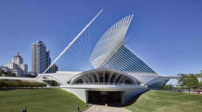
The Milwaukee Art Museum, USA
Architect: Santiago Calatrava (Spain)
While the museum found its inception in 1888, this building sprouted in the early days of the 2000s decade, in 2001. It is said that it is the peak achievement of architect Santiago Calatrava. Fun fact about this exceptional building: it has moving wings with a wingspan of 217 ft (66 m) that change position depending on the time of the day to provide shade and shield the building from extreme weather.
It is interesting to note that Frank Ghery made the list twice and that only one woman architect made it as well. This also highlights the important questions of selecting the right architect for the project and if talent should be sought locally or if international competitions are the way to go. In Canada at least two buildings have made the front page regarding their architecture, the new building for the Vancouver Art Gallery and the Nova Scotia one! One had its facade redesigned after consultation with the local and Indigenous population, while the other was designed from the get-go by a group of Indigenous architects, Elders and Indigenous artists. Is there a lesson to learn here? Any thoughts on that?
Did we forget one? Is there a museum you feel should have been part of the list but isn’t? Any new construction you have your eyes on? Tell us on social media!
Want to know more – we suggest a few books:
- The Culture Factory, Architecture and the Contemporary Art Museum by By Richard J. Williams.
- New Museum Design by Laura Hourston Hanks
- Museum Space: Where Architecture Meets Museology Paperback by


